CSS line-clamp animation
This is a rough experiment for using line-clamp but animating between the truncated and fully expanded states. We’re not able to apply a transition to the -webkit-line-clamp directly so my solution requires some extra steps to smoothly animate between states.
-webkit-line-clamp truncates a block of text at a given number of lines. This is something that isn’t easily done without line-clamp, it would require calculating and setting a fixed height to the text block and hiding overflowing content. There is actually really good support for line-clamp even though it is unfortunately only available with the webkit prefix.
Animation steps
To efficiently transition between the two states, truncated and expanded, we need to calculate and set some CSS custom properties at the time of the transition. This calculation requires the layout to take 3 different states.
State 1 is the truncated state using -webkit-line-clamp: 3; to clamp the number of visible lines of text to 3. While in this state we get the height of the container element using getBoundingClientRect and set it as a custom property on the container, this custom property is used for a max-height on the container max-height: var(--truncate-height, auto);. This max-height won’t do anything in this state since the height of the container is already naturally that height.
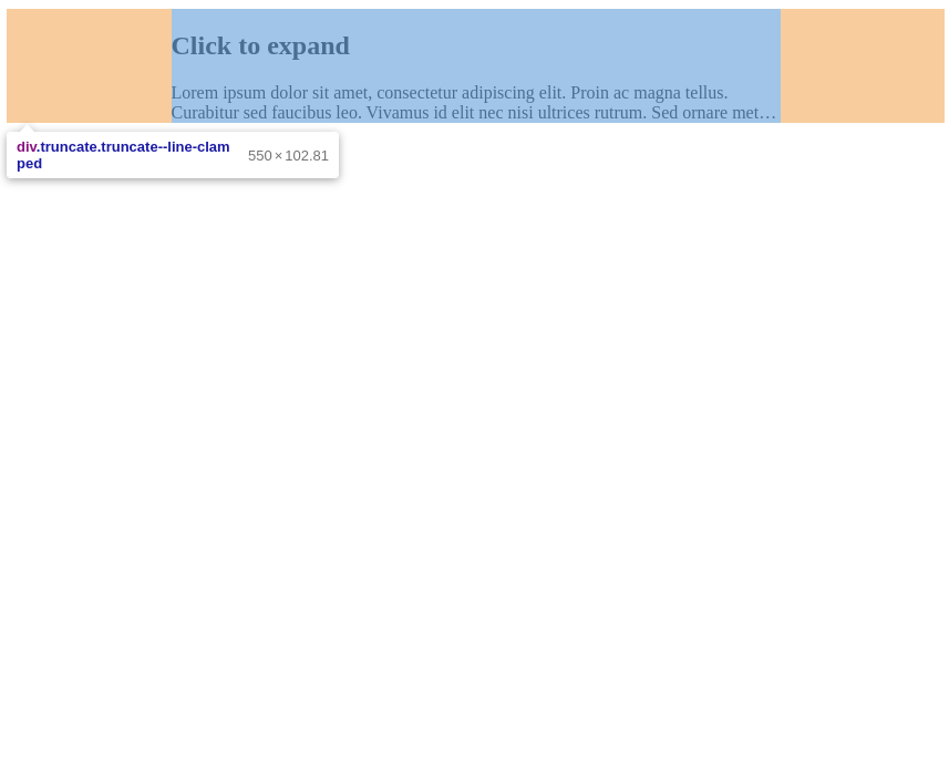
State 1, content truncated by line-clamp
State 2 removes the line-clamp property, but because the max-height has already been set the container doesn’t change in size, the only visual change is the ellipsis at the end of the truncated text is removed. The container has a second level inner element inside of it, when the line-clamp is removed from the container the inner element is able to expand to accommodate the full height of the content within. The inner element expanding is hidden visually due to the max-height and an overflow: hidden; on the container. With the inner element expanding we’re able to again use getBoundingClientRect this time on the inner element to know the height of the full content. We set this height of the full content as another custom property on the container.

State 2, inner element expanded to full height, container still truncating content
State 3 Now we know the height of the container when truncated, and the height it should be when fully expanded. We’re able to use a CSS transition to apply a smooth animation between these two heights.
These three states require some coordination to ensure the heights we’re getting from the dom are correct. If we were to remove the line-clamp and measure the height of the inner element then we may run into a race condition where the browser hasn’t repainted the new layout and we would get the wrong values from getBoundingClientRect. To avoid this we use a requestAnimationFrame callback after the line-clamp has been removed so we know for sure that the browser has been updated and we can accurately get the values we need.
View the simple demo on codepen.
See the Pen Line clamp toggle animation by Derek Morash (@derekmorash) on CodePen.
Wrap up
I’ve also made a slightly nicer demo with a reuseable web component. The web component allows you to easily add content in truncated/expandable blocks with the following HTML. The component takes a single attribute to set the number of lines that the block should clamp to. Because of the nature of web components this is a progressive enhancement feature, older browsers that don’t support web components will simply ignore it but still show the full un-truncated content.
<truncate-lines line-clamp="3">
  <p>Some text content goes here</p>
</truncate-lines>
See the Pen Line clamp toggle animation by Derek Morash (@derekmorash) on CodePen.
Future
To make this fully responsive it’d be a good idea to add a resize observer to the container so we know when the height values need to be refreshed to accurately layout the content. I may add this to the web component demo in the future.